Transcript: Using generative AI to improve digital accessibility efficiency, featuring Copilot, Whisper, and Claude
Contents
About this transcript
This is a transcript of the Using generative AI to improve digital accessibility efficiency, featuring Copilot, Whisper, and Claude presentation.
Watch the presentation
Transcript Options
To make the transcript more readable as a standalone resource I have added images and videos from the presentation within the transcript. Since I described the parts relevant to the presentation within the transcript there will be some duplication.
You may prefer to use the radio buttons below to hide the images and videos to save bandwidth or reduce potentially duplicate content.
Introduction
Matthew Deeprose: Thank you very much, Phil. Just want to check I've got that setting. Hopefully, you can hear me and see my slides.
I'm Matthew Deeprose, Accessible Solutions Architect from the University of Southampton. For those who don't see me: I'm a white male in my late 40s. I'm wearing glasses, a charcoal suit with a moss green shirt and matching pocket square. My pronouns are he/him.
Overview of the Presentation
Today, I'll share how I've used generative AI to improve digital accessibility efficiency based on my experiences with:
- Copilot
- Whisper
- Claude AI
I have a webpage with all the details I share today, along with the slide deck, available at go.soton.ac.uk/kent2. That's the number two at the end, all as one word. Stephen has added the link to the chat.
Opening Theme
To open the theme of this presentation, let's start with a tweet from @McgarDana, posted in 2021:
"Accessibility isn't more work. You were just cutting corners before. The work was incomplete."
She's saying that a webpage, document, or online service isn't ready until everyone can use it, regardless of any disability or impairment. However, for our colleagues, making content accessible may seem like more work, as it is a new area for them.
So, my question is can we use AI to:
- Reduce effort?
- Decrease workload?
- Increase efficiency in any digital accessibility workflows we might expect our colleagues to complete?
Structure of the Presentation
My presentation has two parts to answer these questions.
First, I'll share how Microsoft Copilot, OpenAI's Whisper and Anthropic's Claude.AI made certain digital accessibility workflows more efficient by reducing my time. There's more details on these in a recent presentation on my website, so this will be more of an overview and you can find more detail on my site…
Next, using a recent example, I'll discuss how Copilot and Claude.AI helped me create a tool for academic staff to make certain resources more accessible to a specific student group.
Scenario 1: Sample content
Let's start with a short and fairly niche scenario, which I call:
I'm meeting teams around the university who want an introduction to digital accessibility. We have online training available, but meeting teams and discussing accessibility within the context of their work with examples can be quite effective.
However, I've found it's better not to use real-world content. If we don't approach this carefully, colleagues might feel that their content is being singled out.
Creating example content that is more meaningful than a chunk of lorem ipsum placeholder text can be a challenge.
I gave a session to a group of project managers and analysts. In preparation, I asked Copilot to create a project update document for a fictitious project aimed at making project managers more efficient by using cats.
- The document was to include:
- An overview of the project aims
- Red-amber-green ratings for time and cost
- A list of deliverables
- A roadmap
I could then adjust the content by adding accessibility issues myself for the group to remediate during the session.
On-screen, I'm browsing through my document. I’ve added defects like:
- Low contrast issues
- Red-amber-green ratings that use colour alone to express meaning
- A table without proper headings
- Poorly crafted links
- Lists without proper list semantics
The content itself is slightly facetious but I’ve avoided using real-world content or lorem ipsum placeholder text. The document contains elements that would typically appear in a project document, and it took me only 10 minutes to create.
Creating fictitious content from scratch is time-consuming. Using Copilot for this task saved me a lot of time.
Read the prompt I wrote for creating sample content
Adjust this prompt to suit the context and content you require. This is just an example.
Please create a project update document for a fictious project that aims to make university project managers more efficient in delivery of project outcomes using cats.
The outline should include:
- an overview of the project aims.
- red/amber/green ratings for time and cost.
- a list of project deliverables.
- a project roadmap.
Scenario 2: Creating a Transcript from Corrected Video Captions
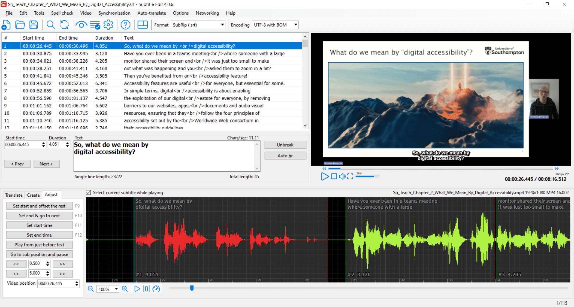
Back in January this year, we were creating an accessibility video for our doctoral college. Having completed the captions using Subtitle Edit, we wanted to create a transcript.
Importance of Transcripts
Transcripts have many benefits:
- Not everyone wants to or can watch a video.
- Transcripts allow for more ways to engage with content.
Here’s feedback from a member of our neurodivergent staff group that explains this well:
The thing that I find most annoying is the way online training is often set up. I don't learn well with videos, flashy moving images on screens, or endless things to click on to flip or open or whatever. It can get disorientating, and it makes it harder to take in the information because of the demands of interacting with the screen. My attention goes on interacting with the screen rather than taking in the information.
I'd rather just be given the information transcript-style so I can just read it (with images where they'll add something useful). I connect information into a whole better when I can see it all in one go, jump back and forth to double check things, and read it/process it at the speed I need to.
Feedback from a member of University of Southampton's Neurodivergent Staff Group
Further Benefits of Transcripts
- Transcripts make it easier to create further resources, such as blog posts or articles, depending on the context and purpose of the original content.
- From an accessibility point of view, as well as being a benefit, depending on the level of compliance we are aiming for, we are required to provide equivalent alternatives to media content, such as a well-prepared transcript.
Creating a Readable Transcript
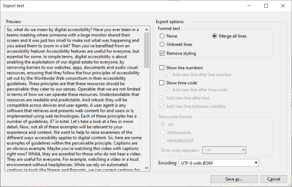
While Subtitle Edit has an export text feature to turn captions into a single block of text, that block is not very readable. Although I had added punctuation while creating the captions, there were no paragraph breaks. Editing the text to insert paragraphs is time-consuming and tedious, especially if you’re unfamiliar with the original content.
I wondered if Copilot could make this process faster. So, I wrote a prompt asking it to:
- Reformat my transcript to be more readable.
- Add headings, paragraph breaks, and use bullet points where appropriate.
In my initial testing, I found that Copilot rewrote the text of my transcript. To resolve this, I added further instructions, specifying that the words and their order must remain unchanged.
On-screen, I’m showing a recording of Copilot Notebook running that prompt. It reformats the transcript as requested, adding:
- Paragraph breaks
- Headings
- Bullet points, where appropriate
Although I still had to check the results and make some changes to suit my preferences, it saved me a lot of time and avoided the monotony of manual editing.
I’m now showing a Word document version of the transcript, with the navigation pane open. The headings have been set using heading styles, making them usable by assistive technologies.
Read the prompt I wrote for creating a transcript from captions
The process begins by using Subtitle Edit or a similar tool to convert the captions file into plain text with any timings removed.
Instructions:
Please format the following transcript to be more readable.
Use headings, paragraph breaks, and bullet points as appropriate.
Important: because this is a transcript, it is essential that the text itself is kept verbatim. Please make sure you do not change any of the original words or the order in which they are presented.
Transcript:
...
Scenario 3: Creating a transcript for a podcast
In our third scenario, we're approaching transcription from a different angle.
The Meliora podcast from the Sustainability and Resilience Institute at the University of Southampton examines topics surrounding sustainability.
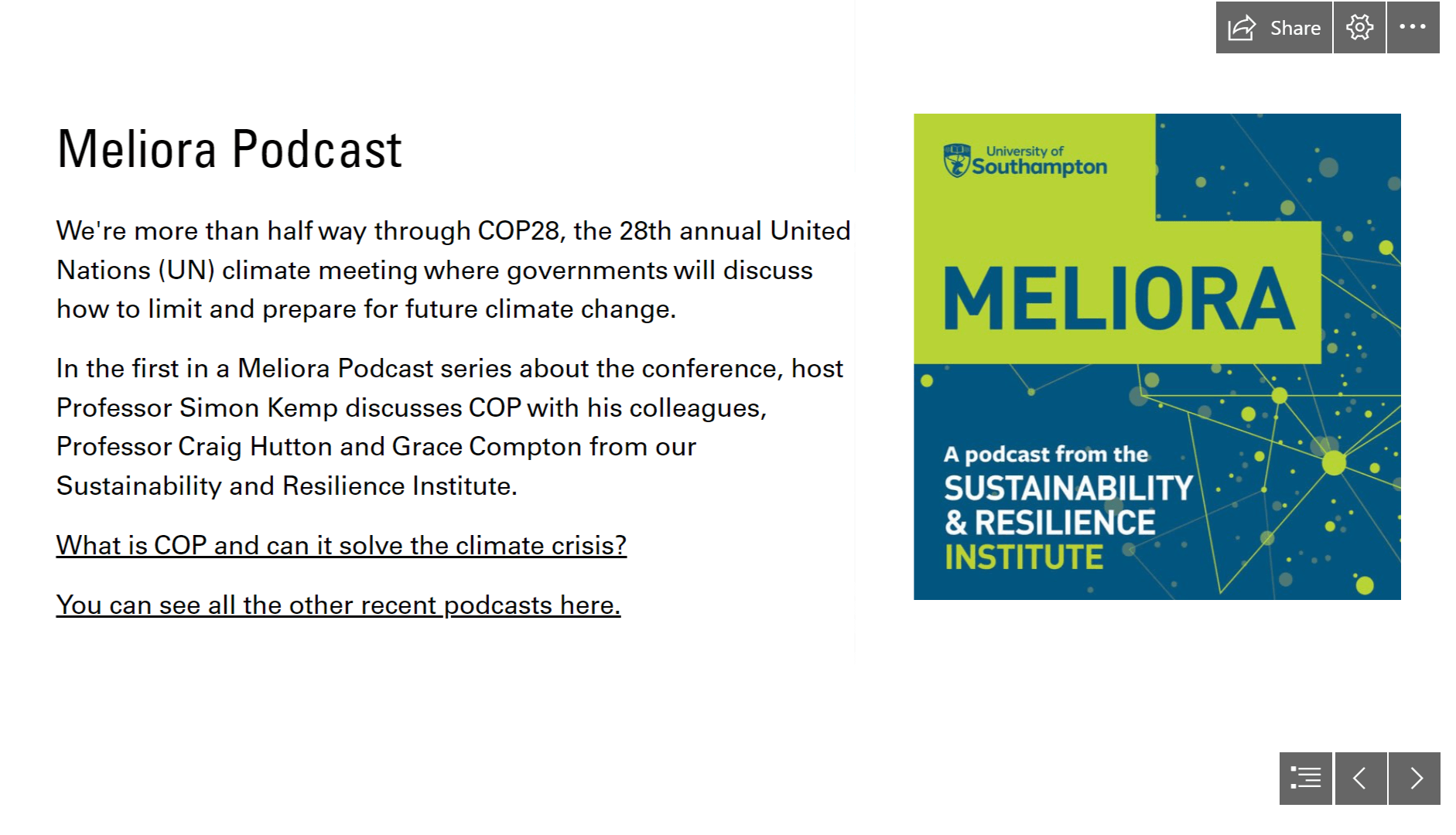
On-screen, the podcast is advertised in our internal University Staff Matters newsletter. However, one of our colleagues in our communications team, who writes the newsletter, is profoundly deaf and cannot listen to the podcast. She and the podcast host, Professor Simon Kemp, got in touch with me to ask what options were available to make transcripts for the podcast.
Since the podcast is an MP3 file, what tools did we already have that could help make a transcript?
- We use Microsoft Stream, but it can only create captions for video files, not audio files.
- Converting an MP3 to a video file would work, but it requires additional software.
Whisper Desktop
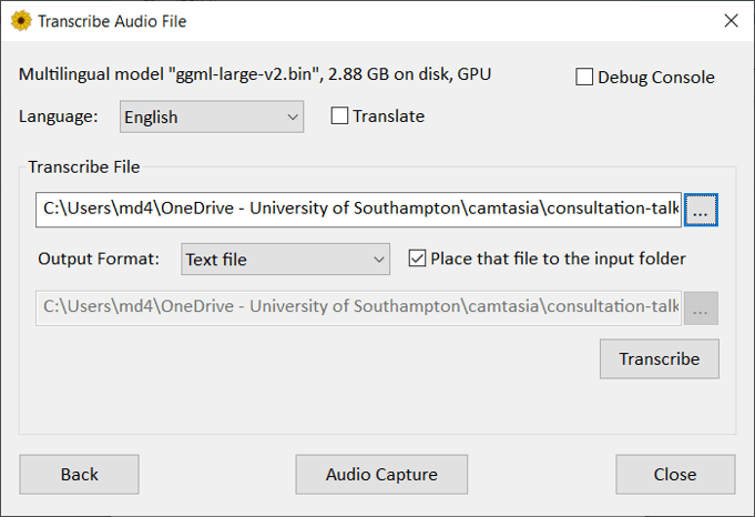
I came across Whisper Desktop. It’s a Windows open-source application designed to run with the open-source automatic speech recognition system Whisper, created by OpenAI.
If you have a good graphics card, this tool can run on your Windows computer and transcribe audio or video files, or live speech captured through your microphone.
On my presentation web page, I have a link to a quick setup guide that I wrote for using Whisper Desktop.
During transcription, you can view a live preview.
On screen, I'm showing the preview while it transcribed one of Simon’s podcasts.
- It’s showing the words it has detected.
- Each word has a colour going from green to yellow to red.
- The colour indicates its confidence for accuracy.
Now, using colour to express meaning is obviously an accessibility barrier, but this preview is optional and more of a curiosity.
It took about nine minutes to transcribe an hour-long podcast on my work computer with a high level of accuracy.
Improving the Transcript
Just like in our first scenario, we have a big lump of unformatted plain text, not very readable. In this podcast, there are five different speakers.
Can we get attribution added so we know who is speaking?
I wrote a prompt for Co-pilot. I gave the speakers names and identified who the first speaker was. I asked it to write the name of the speaker followed by a colon in bold formatting to appear before each person speaks. I'm asking it to do this based on the text transcript, not the audio file.
On screen, I’m showing a screen recording of Co-pilot going through that task. It is adding the name of each speaker in bold before they speak.
Of course, I then ran our formatting prompt we saw earlier.
Now, I’m showing the before and after.
Our initial block of plain text in comparison with a transcript that has headings, more meaningful paragraph breaks, bullet points, and speaker attribution.
It’s definitely not perfect, but it would take someone much less time to fine-tune and correct this transcript using our adjusted version in comparison to our original block of text.
Read the prompt I wrote for podcast transcription
This process begins with using Whisper Desktop to create the initial plain text transcript. Here is my guide to setting up Whisper Desktop.
Speaker Attribution
Instructions:
I will paste a transcript from a podcast. The speakers' names are:
Simon Kemp
Grace Compton
Craig Hutton
Lily Kilner
Sophie GreenI would like you to add speaker attribution to the text I will paste, so we know who is talking. Do this by writing the name of the speaker followed by a colon in bold formatting when each speaker speaks. The first speaker is Simon Kemp.
Transcript:
...
Scenario 4: Visualising and describing processes
My final scenario in this first section of the presentation is something I came across just last week.
Access to Work
We're finding some challenges with the way the Access to Work scheme is currently implemented, and I wanted to get an overview of the process. The government web page describing the process is 11 pages long if you print it out.
My colleagues use a tool called Mermaid to create flow charts and other types of chart and graph. You can write out a process in a markdown-style language, and it will dynamically convert it into graphical diagrams.
Creating a Flow Chart with Claude
I made a PDF printout and asked Claude to create a flow chart of the Access to Work process. I specified some accessibility settings it should use. I had already prepared a web page that I could paste the Mermaid markup it produced into.
Graphical charts need text descriptions as well, of course. I asked Claude to create a text description of the process in HTML format as an ordered list. I specified that where there was branching in the flow chart, it should specify which numbered step the reader should go to. I could then paste the HTML as a readable written description of the process into my web page.
Results of the Experiment
In less than a minute I had a visual and written high level overview of the process.
This use case was more of an experiment, but I like the idea of getting the AI to create the process map in a simple format I can edit myself as well as providing the long description of that process map. Using a semantically ordered list by the way gives someone using a screen reader a much more predictable and navigable overview of the process.
Copilot can do this too, but I found it would produce errors that I had to fix manually before it would work.
Read the prompt I wrote for creating a process flow diagram and an written version of the process
You are working on a project to provide a process map or flow diagram explaining the access to work process.
I will provide a PDF print out of the government website describing the access to work process.
Please create mermaid markup describing this process. Make sure in the mermaid markup to include suitable accTitle and accDescr keywords and description that you determine are appropriate from the source text.
Follow up with:
Please write a text version of the process, in HTML in the following way.
Add an H2 element that contains a heading something like “Readable Description of the [insert name] process
Create an ordered list element.
Within it create list items describing the process step by step.
Where there are choices, please use the numbers to explain which step to go to, e.g. if Yes, go to step 4, if No go to step 8.
Close the ordered list element when complete.
I will then paste the html you make me into the webpage. I have already included a script element to import mermaid from a CDN.
Of course, results must be checked for accuracy. But this should reduce the initial workload.
Concluding the first part and starting the second
That concludes my section on using generative AI to make workflows more efficient.
Back to 2021 – Colour matrix
To introduce the next section, let's go back to February 5, 2021, when Phil invited me to speak at what I think might have been the fifth of the Digitally Enhanced Education webinars.
I explained colour contrast and digital accessibility and introduced a tool I made that checked which university brand colours we could use together while meeting the Web Content Accessibility Guidelines criteria for contrast. Since that presentation, I've used the tool to create these look up tables for around 20 universities and organisations.
Accessibility helpers
I love these minimal webpages that offer one useful feature. Here are a few of my favourites:
- Arizona State University has brilliant AI tools anyone can use. Recently, I used their Voiceover generator to create an audio description for a video.
- Button Buddy helps you choose accessible colours for your buttons, including focus and hover states.
- The tanaguru contrast finder helps when you must use a certain shade, like orange with white text, which usually lacks sufficient contrast. This tool finds shades close to your intended colour but with sufficient contrast.
I often have ideas for tools like this, but as a non-professional developer with only fundamental JavaScript knowledge, it takes me weeks or months to complete a project in my own time.
Could AI help?
Medicine diagram request
A few weeks ago, a colleague forwarded me a question from someone in our Medicine faculty who teaches Embryology and prefers creating their own diagrams. They attended an accessibility session and wanted to ensure their diagrams wouldn't present a barrier to those with colour vision deficiency or colour blindness. The screen shows an example: a section of the developing embryo with ridges (green & pink) that will form the urogenital system.
In my slide deck I have a hidden section that explains colour blindness or colour vision deficiency, which is the term the NHS uses and which I will now abbreviate to just CVD. I had to drop it for the live presentation so I could fit it into our available time.
First experiments with CVD – colour randomiser
I explored CVD a little already when I created this colour suggester web page, a follow-up to the colour matrix, aiming to help colleagues find new colour combinations from our brand that have sufficient contrast.
Pressing the randomise button selects a random background colour and shows a text colour and three graphic colours, all with sufficient contrast. I added buttons to simulate how those colours look with different types of CVD.
It took me about three and a half weeks of evenings to complete this as a personal project, as I first had to figure out what I needed to do and then search online to learn how to do it.
To simulate CVD, I used Nicolas Burrus' public domain implementation.
Using colour for meaning
When expressing meaning with colour, we should add another method to aid understanding. This fictitious example shows an assignment submission screen with a red "no" button and a green "yes" button, challenging for those with protanopia or deuteranopia, which are types of CVD. Colours can have different cultural meanings too.
Adding Yes and No labels make this easier to understand for everyone.
Colour vision deficiency friendly colour palettes
In this case with Medical diagrams, labels may not always be desirable for example in an assessment. I found a helpful document by Alexandra Phillips at the National Center for Ecological Analysis and Synthesis, which lists CVD "safe" palettes.
I first wanted to confirm these colour schemes would work as intended. I wanted to view how these colours would appear to those with CVD.
I took the colour codes for each palette and put them into a small piece of JSON data. I wanted to use this seed to create a web page showing the colours with different types of CVD, but I lacked experience creating web content from data. So, I wrote a prompt for Copilot.
The prompt is quite long, so I'll highlight a few key points. You can find all the prompts on the presentation web page.
First, I told Copilot to roleplay as a senior software engineer passionate about digital accessibility. I explain the structure of the data that I want to it to use. I didn’t know how to generate content using data, but I did know how I wanted the data presentation to be structured, so I was very specific about every detail.
Copilot wrote the JavaScript to do exactly what I wanted. I used that to build the page, implement the CVD simulation, and verify each palette's performance. On the screen, I'm scrolling through the resulting web page.
Read the prompt I wrote for creating a table showing different colour vision deficiency friendly palettes
You are a senior software engineer with a passion for digital accessibility and the web content accessibility guidelines at level A and level AA. When you create content, you strive to make it as digitally accessible as possible.
You are also confident when given instructions to ask questions and suggest alternative routes to achieve the same goal if you think they will be better.
You have been given the following task. The overall goal is to create set of tables based on data of colour palettes.
Please create a JavaScript or snippet that will do the following.
You will use a set of data held in the cvdp.json file in the same directory as the webpage you will work on.
The cvdp.json is structured as follows. A key called “palettes” contains multiple colour palettes. These are structure as a further key for the name of the palette, with an array containing a set of colour codes in hex format that make up each palette.
Within a div with an id of “insertHere”, for every palette in the JSON file, you will:
create a <section> element with an ID of the palette name with the word “Section” appended to it. You will remove any spaces from the ID e.g. abcPaletteSection.
Create an <h2> element at the start of the section containing the name of the palette e.g. “abc Palette”.
Create a <table> with an ID of the palette name with the word Table appended to it, e.g. abcTable.
Create a <caption> for the table with a class of “hidden”. The caption will contain the name of the palette.
The structure of the table is to be as follows.
The first row is the column heading. There will be five columns in every table. The first column name is “Colour”, the second column name is “Trichromacy”, the third column name is “Protanopia”, the forth column name is “Deuteranopia” and the fifth column name is “Tritanopia”. These names will be the content of each cell that makes up the column heading row.
The first column will be part of a <tr> element with a “role” of “row” within a <thead> element with a “role” of “rowgroup”
Each cell for the column heading will be a <th> element with a “scope” of “col” and “role” of “columnheader”
Each subsequent row will be for each colour in the palette. It will be part of a <tbody> element with a “role” of “rowgroup”. Each row within that will be a <tr> element with a role of “row”.
The first cell of each row will be a row header, it will be a <th> element with a “scope” of “row”, a “data-label” of “colour” and a “role” of “rowheader”. The content of the cell will be the colour code in hex format from Json data for the palette. So for example the second row, which is the first non-column row will be about the first colour in the palette, the next row will be the second colour and so on. The rows will finish when all the colours in the palette have been parsed.
All the cells in the second column from this row onwards will be <td> elements given a class and “data-label” of “trichromacy” and role of “cell”. Each cell will have a style where the “background-color” of the cell is set to the current hex colour from the content of the palette being parsed and will match the content of the first cell in each particular row.
All the cells in the third column from this point will be <td> elements given a class and data-label of “protanopia” and role of “cell”. Each cell will have a style where the “background-color” of the cell is set to the current hex colour from the content of the palette being parsed and will match the content of the first cell in each particular row.
All the cells in the fourth column from this point will be <td> elements given a class and data-label of “deuteranopia” and role of “cell”. Each cell will have a style where the “background-color” of the cell is set to the current hex colour from the content of the palette being parsed and will match the content of the first cell in each particular row.
All the cells in the fifth column from this point will be <td> elements given a class and data-label of “tritanopia” and role of “cell”. Each cell will have a style where the “background-color” of the cell is set to the current hex colour from the content of the palette being parsed and will match the content of the first cell in each particular row.
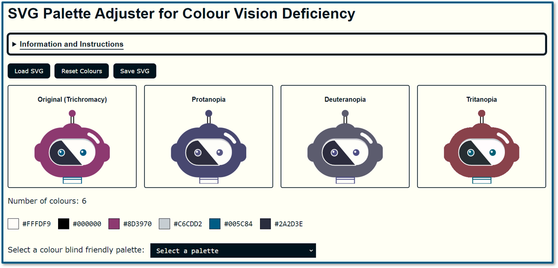
- Result, after some manual tweaking: Colour vision deficiency friendly palettes.
Making a tool
So, we had potential colour palettes and could verify their effectiveness, but it still wasn't user-friendly. What could we do? Fortunately, the example images provided were vector-based, and I could save them as SVG files, Scalable Vector Graphics. SVG files are just text and they use HTML colour codes, giving me an idea.
What if we had a tool where you could:
- Load your SVG file
- See how it looks with different types of CVD
- Identify the colours used in the file
- Swap colours using a CVD-friendly palette
- Save the modified file
So, I wrote another prompt for Copilot, trying to be as specific and descriptive as possible. Again, you can read the whole prompt on the presentation web page. Because it is quite long. Copilot wasn't able to do it for me though.
I've heard great things about Claude AI from Anthropic. It's supposed to excel at tasks like this. Out of curiosity I paid for my own personal licence to use Claude. It quickly built something for me from the same prompt.
After a few back-and-forths to improve it, I had a version I could build upon. This is the version Claude made. We have buttons to upload the SVG file. The image displays in four windows, but the CVD simulation isn't implemented yet. We have the list of colours in the SVG and options to change the colours using a palette from the JSON file we saw earlier.
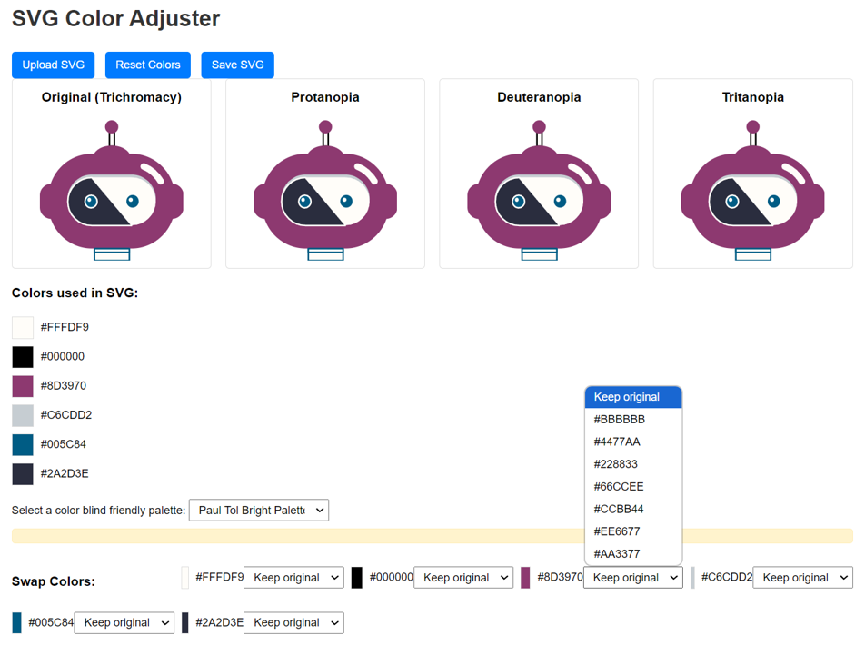
Next I took that code and added it into my website, and implemented the CVD simulation.
After about four hours of effort across four days, I was ready to meet the academic and demonstrate the tool.
- I show how to download the picture in SVG format from the PowerPoint he provided
- Load it into the tool I made
- Preview the image with different types of colour vision deficiency
- Get a list of the colours used in the image
- Pick a CVD friendly palette
- Change a colour in the image to one from the palette
- Preview how the change looks
- Download the SVG
- and load it back into our PowerPoint.
In this demo I'm just demonstrating the process, I'll leave it to the academic to judge whether his images need updating, and to find out which palettes may work best. We've arranged to meet in December to follow up.
Read the prompt I wrote for creating a tool to adjust SVG images with CVD friendly palettes
You are a senior software engineer with a passion for digital accessibility and the web content accessibility guidelines at level A and level AA. When you create content, you strive to make it as digitally accessible as possible.
You are also confident when given instructions to ask questions and suggest alternative routes to achieve the same goal if you think they will be better.
You are working on a project that aims to help people adjust SVG images to use a selection of colour blind friendly colour palettes so that the SVG images will be more understandable by those who are colour blind.
The task you have been given is:
Create a webpage using HTML, CSS and Javascript or Jquery that allows a user to upload a SVG file. No data will go to a server, everything will occur on the client side.
Once the SVG file is uploaded, display the same image in four containers.
The first should have the class “trichromacy”,
The second should have the class “protanopia”,
the third should have the class “deuteranopia”,
the fourth should have the class “tritanopia”.
Note that we already have a solution to implement colour blind simulation, so for your task, all that is important is setting the class for each container.
Since these four images may not display tidily, it’s important that this is a responsive webpage.
The containers should show the whole centered SVG, maintaining its aspect ratio, using for example object-fit: contain; and object-position: center; If the SVG doesn't have a viewBox attribute, one should be calculated and added to ensure proper scaling.
Identify all the unique colours used in the SVG and display their names and their colours on screen to the user.
We have prepared a list of colour blind friendly colour palettes in the https://matthewdeeprose.github.io/cvdp.json file. The cvdp.json is structured as follows. A key called “palettes” contains multiple colour palettes. These are structured as a further key for the name of the palette, with an array containing a set of colour codes in hex format that make up each palette.
Provide the user with a drop down menu to select a colour blind friendly colour palette from the cvdp.json file. Since the palettes have different numbers of colours, only show in the drop down the name of the palette and how many colours are available and only allow the user to select a palette that has the greater than or equal to the number of colours in the palette.
If the number of colours in the SVG file is larger than the number of colours in any of the palettes, then offer the palette with the largest number of colours available. Inform the user how many colours are in their SVG and that it exceeds the amount available in the palette.
Once the user has chosen a colour palette, show them an interface that shows the colours in the original SVG file and the colours in their chosen colour blind friendly colour palette from the cvdp.json file. Make this attractive and usable by showing the colours in the SVG side by side with the colours available in the palette.
Allow the user to choose to swap colours in their original SVG for colours in their chosen colour blind friendly colour palette.
Dynamically update the on-screen image in the four containers with the new colours as the user chooses them. They can then view the results and experiment with different palettes and different colours until they find a palette that will present their image in a way that those who are colour blind can distinguish.
When the user is happy with the result, provide a way for them to save the SVG file with their updated colour scheme.
Provide a “reset” button so that users can reset the colours back to how they started.
Provide an “upload new SVG” button so that users can start the process again with a new SVG file.
- Result, after several iterations, manual tweaks and follow up prompts: SVG Palette Adjuster for Colour Vision Deficiency.
Using AI to help create accessibility tools
So, can AI help us to create tools like this? In my limited experience so far, Yes.
Of course, I kept the scope of my idea as limited as possible, and I'm not doing anything that would need authentication or storage, so the technical scope is very simple.
With this use-case, what else could I do? Maybe hope there would be a hackathon at some point where teams could come up with ideas and produce proofs of concept in a limited time.
Using AI in this way made me feel like I was in my own little hackathon with me playing the role of the product manager and the AI working as a developer, helping to realise my vision.
Of course, this approach won't work for everyone, in my case I already have some knowledge of web technologies and I have a website to host these types of tools. I also have an idea of what should be possible and how it might be done, which can help to write good prompts.
Most importantly, I know how to test that the results are accessible and if I find problems I should have a good idea of how to resolve any defects.
Conclusion
Let’s draw to our conclusion.
Reflecting on the first part of the presentation, which covered whether gen-AI could make certain digital accessibility workflows more efficient, the crucial first steps are identifying potential use cases where AI could help. Finding these requires imagination and inspiration, followed by patience to test and validate. This is where I feel I am most of the time.
Next, we must find ways to make this more approachable and user-friendly. Not everyone wants to use a prompt. Web-based "turn-key" solutions will be more effective and can use APIs to parse more text. I really love Arizona State University's approach, which uses simple pages to perform discrete generative AI tasks.
In the second part, we saw that generative AI tools helped me to quickly turn ideas I wasn't sure how to implement into reality. This use case may be particular to me, but I'm sure others in similar roles could explore this if they are not already. I often have ideas for useful tools that can benefit an area of digital accessibility, and now I look forward to using this new power.
Your ideas
I hope at least one of the ideas I shared from my experience is new to you. I'm very keen to hear from colleagues about any use cases they identified where genAI can assist with digital accessibility, so please share your experiences in the chat. Feel free to connect with me on LinkedIn to continue the conversation.
Thanks and back to you, Phil.
Questions and answers
Dr Phil Anthony: Blimey, Matthew, that was outstanding. I would suggest sitting down if you weren't already because that was quite something. I would just like to say, I posted in the chat, that was a lot to take in quite a short space of time, but don't worry because we're recording the session. You can re-watch this recording on our YouTube channel. We'll hopefully get that up there tomorrow.
But wow, what a great talk. I'm just going by the number of reactions that were coming in throughout your talk, Matthew. I know that lots of people were really enjoying that.
We have a number of questions. If you would like to ask a question, if you could raise your hand and if we've got time to come to you, we will. But in the Q&A, we've got one from Ros.
Whisper vs Word Dictate
Ros asks, "Is the Whisper audio transcription any better than the built-in ones within Dictate in Microsoft Word, where you can upload an MP3?"
Matthew Deeprose: That is a great question, Ros. I'm afraid I haven’t tested. I didn’t even know you could upload an MP3 into Microsoft for dictation. So I need to test that myself. I can’t answer it, but I do know that I have been very impressed with the quality of Whisper’s transcription. But you do need to have a good graphics card in your PC to use it.
Although I just read, things are moving so fast. I read yesterday a new version has been put out there, which should work on lower-powered machines as well. If I can find it, I’ll dig out the link. Thanks, and back to you, Phil.
Headings from Generative AI tools that transfer into Word
Dr Phil Anthony: Great. Thank you. We've got another one from Gill. "Matt, how do you create headings with AI that work in Microsoft Word?"
Matthew Deeprose: Great question. Hello, Gill. Great to have you with us. What I have found is the outputs produced by Copilot are in a type of Markdown language. So it’s a markup language, but for some reason, it’s called Markdown. I have found that if you Google, you can find a Markdown to Word converter.
Also, I have had experience where I’ve downloaded the result from Copilot as a Word document. But in those cases, sometimes I found that the headings hadn’t been actually transferred across properly.
But it’s very quick to apply headings. My top tip, if this is new to you: the keyboard shortcut, hold down "Control Alt" and then the number 1, 2, or 3, and when you’re in Word, that will change the text to heading level 1, 2, or 3. If you use 4, you get a Euro symbol, but 5 and 6 also work. I haven’t worked out how to make it not do the Euro symbol and do heading level 4, but it’s very rare that I get down to level 4 headings usually. Although I don’t have a great answer, hopefully, I’ve given you a coping strategy to get your headings done faster.
Thanks, and back to you, Phil.
What version of Copilot was involved?
Dr Phil Anthony: Thank you. We've got one more in the Q&A and then we’ll open it up. So if anyone wants to ask a question, I think we do still have a couple of minutes left. So this one’s from Emma. "What version of Copilot are you using here?" She's wondering if it's Copilot for 365, for example, in Word, or the browser version in Edge.
Matthew Deeprose: I’m using the version in the browser that anyone else should be able to use. So you should be able to use it as well, Emma, and great to see you here.
One thing I would say, if you’re a Microsoft institution, once you’ve logged into Copilot, just make sure you see that nice green symbol that shows that you are under either commercial data protection or enterprise data protection, which should mean that anything that you enter into Copilot will not be used for training and it won’t be remembered. Once you log in, you should get 30 uses a day rather than the standard 10, which everyone else seems to get.
Thanks, and back to you, Phil.
Getting started with Prompts
Dr Phil Anthony:
Great. Thank you. So if anyone has any questions, we’ve got a couple of minutes. If you’d like to raise your hand, we can take them. While we’re waiting, I don’t think any hands have come up, none that I can see.
You've covered this already, Matt, but there's one question I'd like to ask you: what advice would you give to anyone who's just at the beginning of this? How would you advise that they start integrating AI tools, like some of the ones that you’ve mentioned? Is there any that you’d recommend playing with first to ease people in?
Matthew Deeprose: Well, I guess Copilot is a great one to start with because many institutions have a relationship with Microsoft, so you don’t have to have too many concerns around privacy and so on.
In terms of starting out using the prompts, I think having an idea of what you want to do—it might sound obvious, but for me, when AI first came along, I thought, "Oh, that’s cool, but I don’t know how I’m going to use it." It took me until the start of this year that I started having those ideas for actual positive and useful uses.
I think in terms of crafting your prompt, if you Google Anthropic Prompt Guide, the company Anthropic has a really good resource on how to craft your prompts. There’s also a video on their YouTube channel where they talk to a bunch of their engineers about how they craft prompts. I’d recommend just having a watch of that because I’ve watched that myself to get some ideas.
I would also recommend, as someone who uses the Reddit website, there are Reddits for OpenAI, local LLMs (which is for people that run LLMs on their own machines), and Anthropic or Claude Reddit. I often find people sharing what they are doing and what’s worked for them. I found that a very good way to learn from others.
I suppose the final thing is just to have a go because you can’t really go wrong with Copilot. You need to work it out for yourself because it depends on what you want to do. I’m afraid that was a bit of a wishy-washy answer, Phil, but back to you for now.
Dr Phil Anthony: You’re absolutely right. Just having a go is probably the first step. Just play around with it because you’ll find out stuff really quickly as you go. I think that’s sound advice.
How accessible is generative AI?
Dr Phil Anthony: Benedict, I have allowed you to unmute yourself and turn on your camera if you’d like to ask your question.
Benedict:Microphone is unmuted. Am I audible now? Cool. Can you all hear me?
Dr Phil Anthony: Yes, we can hear you.
Benedict:Thank you. I don’t know what’s wrong with my camera. Thanks for the presentation. I’m always keen when someone mentions accessibility because I’m one of those that depend on accessibility.
My question is, how much of those accessibility features that you spoke about can respond to the needs of people who rely more on screen readers?
Because what I often find is that sometimes things seem accessible until people like myself, who rely more on screen readers, get to use them and find, oh, this is not quite as accessible as we thought. Did you consider or have you ever thought of maybe looking at accessibility in relation to screen readers or screen reader users? Thank you.
Matthew Deeprose: Thanks, great question. I have not yet tested the web-based versions of ChatGPT and Copilot with a screen reader. I do have a colleague who uses a screen reader, and he uses both Copilot and ChatGPT themselves a lot, and they haven’t shared with me any issues with the performance of those actual tools.
What I can say from my experiences is that I’m always keeping in mind the necessity that the outputs I use AI to create should be accessible. For example, with my prompt for coming up with the tool for changing colours, I specified that they role-play someone with a passion for digital accessibility. Later on, I asked it to write comments on the code that it made to help both me and AI later better understand it.
While it was doing that, it came up with a few ideas. It would say, “I’ve spotted there is a keyboard handler here, so make sure we need to add one with an ARIA label to make sure that it will work correctly with a screen reader.”
The best answer I can give is to have in mind the necessity for an accessible experience as the outcome. But because I wasn’t using the AI as someone with a disability or impairment myself, I can’t give a better answer to the true nature of your question.
Benedict:Thank you so much.
Dr Phil Anthony: Thank you. I’m so sorry, Paul, we have run out of time for this one. But if you could place your question in the Q&A, I’m sure Matthew will be able to take a look at that one at some point during the webinar. So thank you, and thank you, Matt.
In order to keep time, we’re going to move on. So thank you again, Matthew. It’s lovely to have you back on and great work. Really, really great stuff you’re doing there.
Matthew Deeprose: Thank you.
Dr Phil Anthony: Thank you.